
PharmaNZ are a new business to the Australasian Contract Manufacturing industry. Focussed on solving the toughest and most burdensome of production challenges, the team approached me to solve their personal branding challenge.
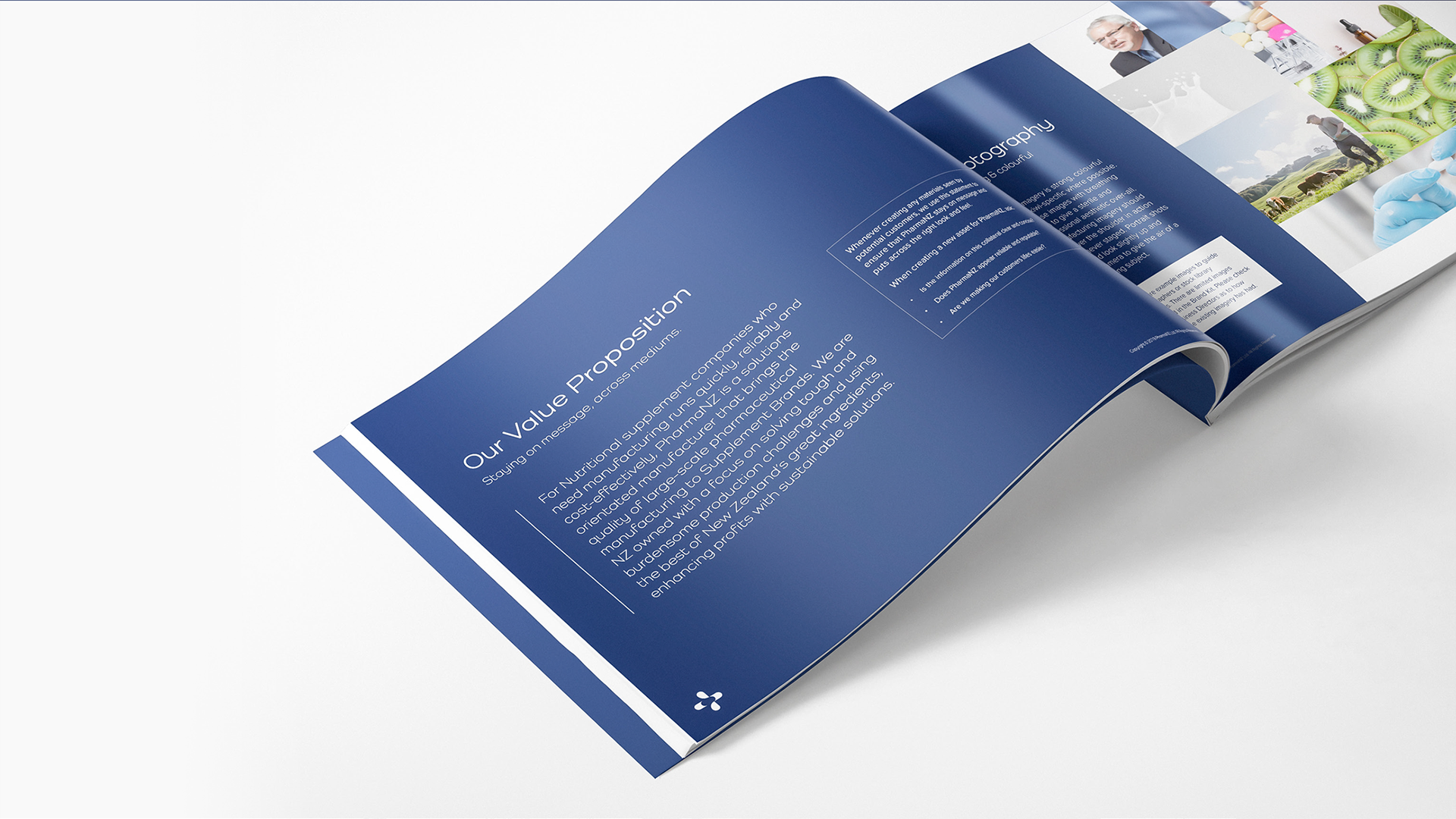
Over the course of the project, I ran strategy sessions with key stakeholders to build a consistent view of the business and working with the owners, developed their value proposition and brand attributes to inform their business development phase. PharmaNZ, at it’s core, is about efficiently solving problems and getting customers products manufactured and delivered. Our brand needed to feel energised, efficient and professional.
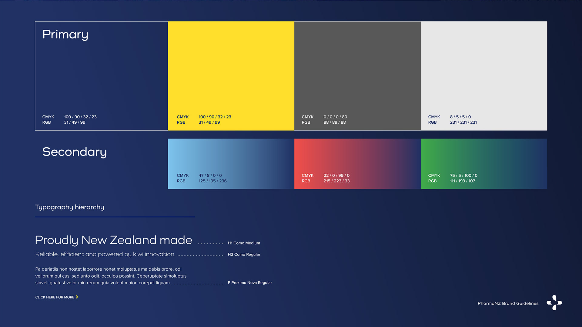
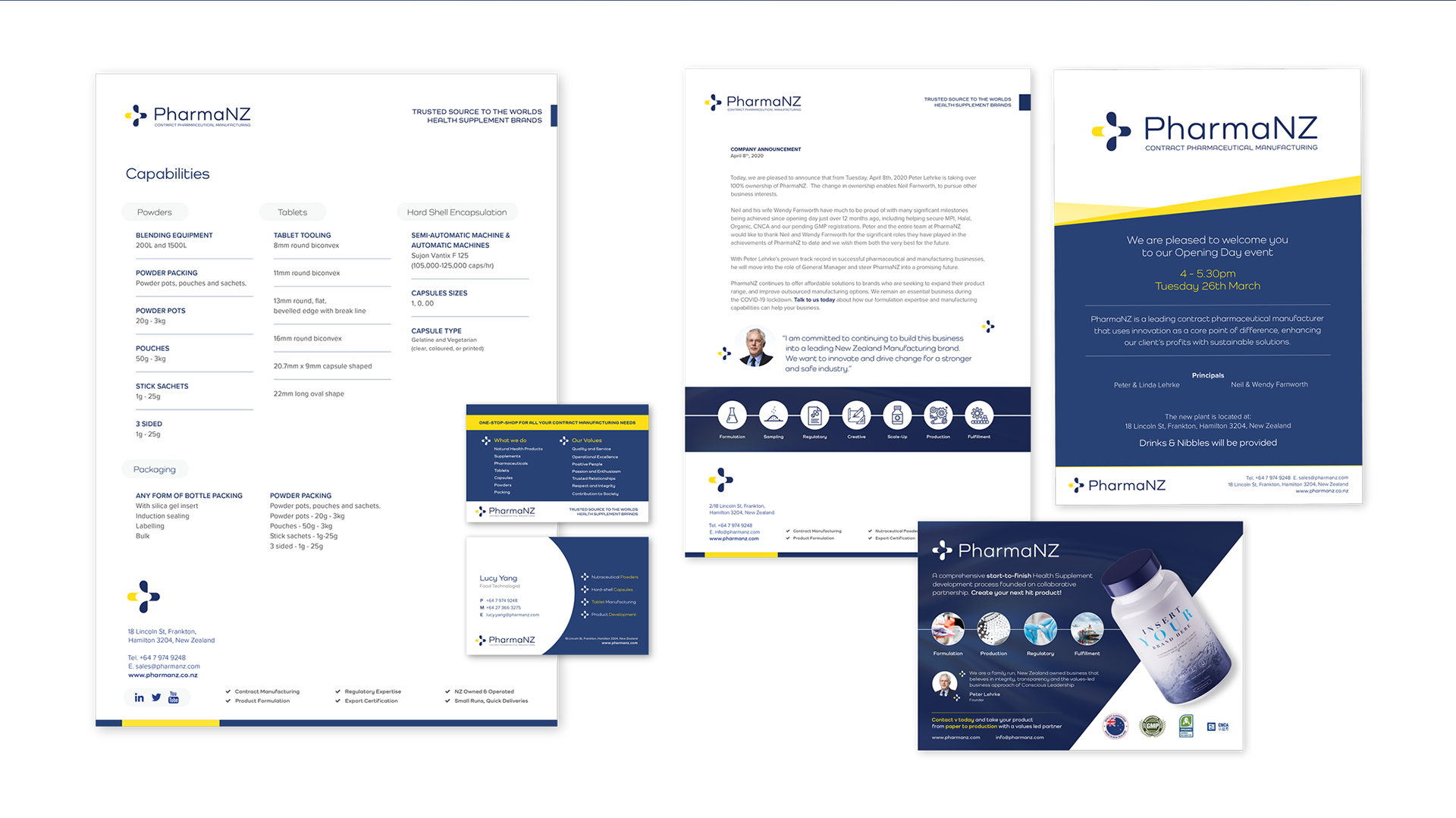
The final product is a simple, easily reproducible icon which utilises negative space to create motion through the icon. Paired with the soft-edged Como typeface, the brand feels personal without losing it’s professionalism. Our colour palette utilises a rich, trusting blue with an energetic yellow to create a dynamic set of primary colours.
CLIENT – PharmaNZ
DATE – December, 2019
LOCATION – New Zealand