
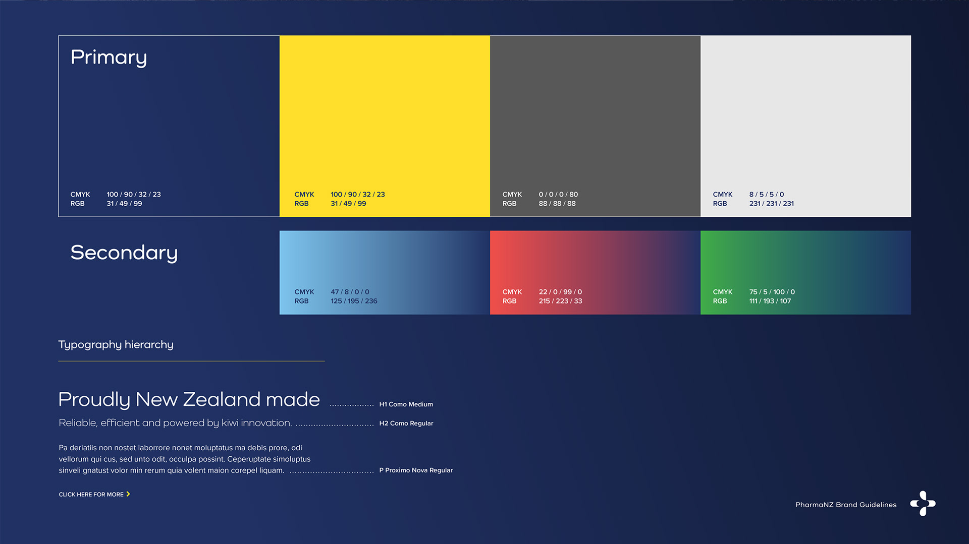
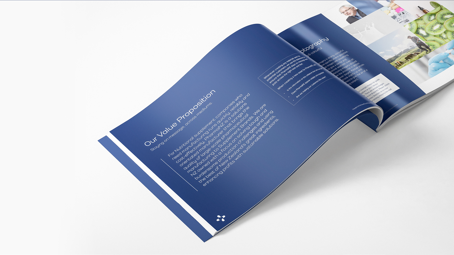
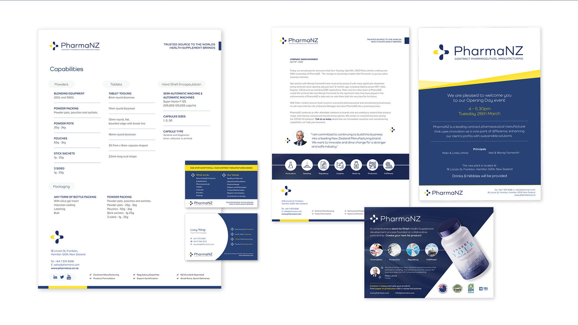
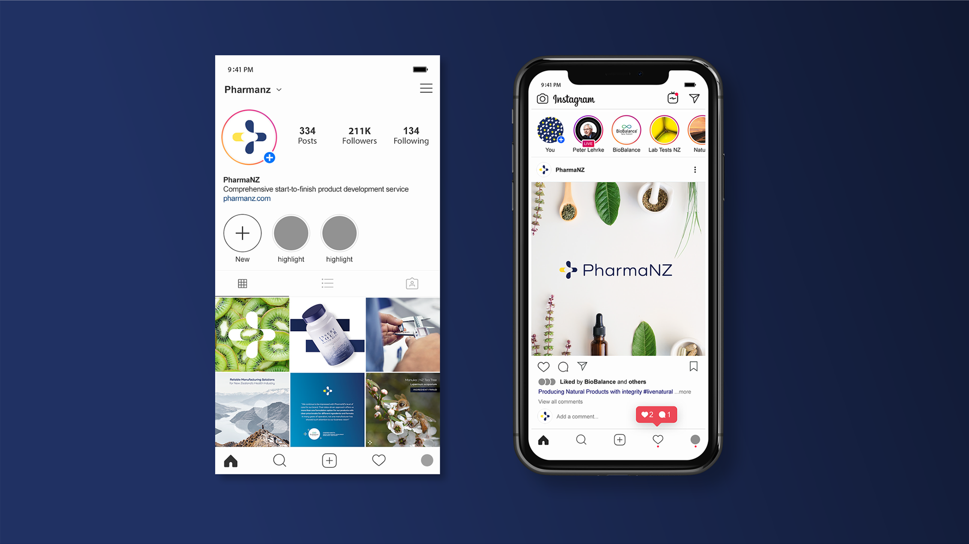
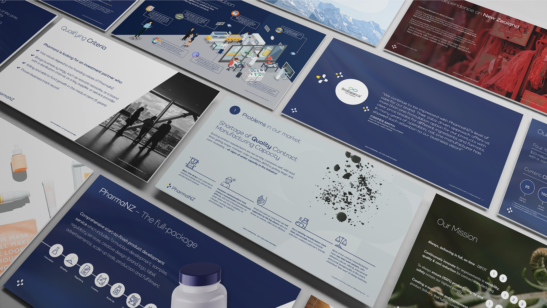
PharmaNZ, a new business in the Australasian contract manufacturing industry, approached me to address their personal branding challenge. Through strategy sessions with key stakeholders, we developed their value proposition and brand attributes. The final brand is energised, efficient, and professional, featuring a simple, dynamic icon, the soft-edged Como typeface, and a color palette of rich blue and energetic yellow, creating a dynamic and trustworthy look.
Project Details
Client: PharmaNZ
Date: 2019
Asset(s): Brand Identity, Brochure, Presentation, Website, Social Media
Tools: Adobe Suite, PPT, Wordpress (ACF)


Like what you see? Get started on your project below...